Jeff Bradbury is an author, podcaster, public speaker, creator of the TeacherCast Educational Network and father of the world famous #EduTriplets.
Are your students struggling to understand complex historical timelines? Many history teachers face a common challenge – helping students grasp and visualize interconnected historical events, especially during pivotal periods like World War II. Traditional textbooks, with their dense paragraphs, often leave students overwhelmed and disconnected from the material.
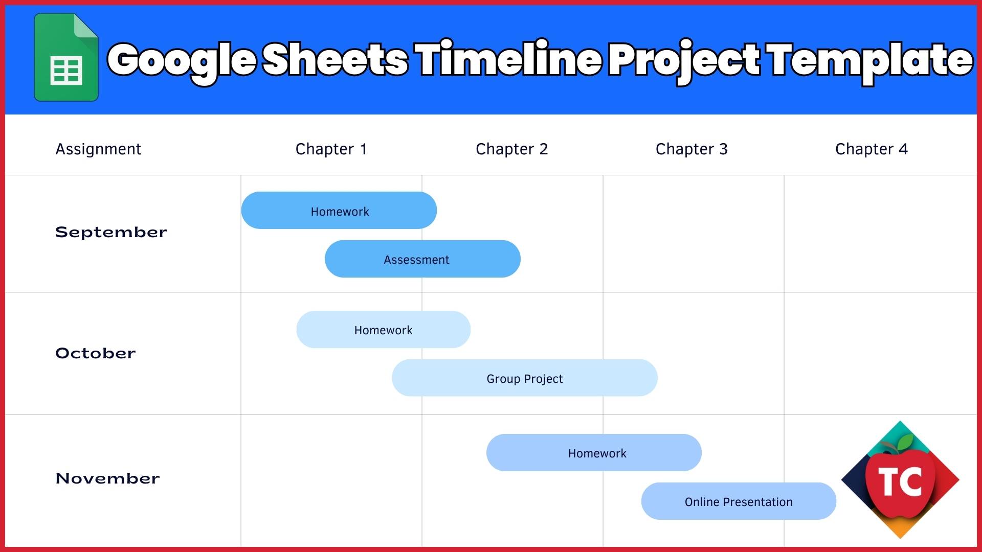
Here’s where Google Sheets comes to the rescue with its powerful timeline feature. This versatile tool transforms complex historical data into clear, interactive visual timelines that enhance student comprehension and engagement. Through hands-on experience with several history classes, I’ve seen how this simple yet effective tool helps students better understand historical relationships and concurrent events.
In this comprehensive guide, I’ll walk you through creating dynamic, engaging timelines using Google Sheets. Whether you’re a history teacher mapping out World War II events, a curriculum planner organizing yearly objectives, or an educator helping students manage project deadlines, you’ll discover how to create interactive timelines that make learning more accessible and engaging.
What You’ll Need
- A Google account (your school account works perfectly)
- Basic familiarity with Google Sheets
- Events or milestones you want to visualize
Let’s Create Your Timeline
Step 1: Setting Up Your Data
First things first – let’s organize our information in a way that Google Sheets can understand:
- Open a fresh Google Sheet (I like to name mine right away to stay organized)
- Create three columns: Date, Event Title, and Description
- Pro Tip: I always freeze my header row to make scrolling easier later
Step 2: Creating Your Timeline Chart
Here’s where the magic happens:
- Highlight your data range (including headers)
- Click Insert > Timeline
- Watch your data transform into a visual timeline!
Step 3: Making It Look Professional
Let’s make your timeline pop with some educator-friendly customizations:
- Use different colors to categorize events (great for visual learners!)
- Add detailed tooltips to provide additional context
- Adjust the date format to match your needs (especially helpful for historical events)
Classroom Application Ideas
- Historical Event Mapping: Perfect for showing cause and effect relationships
- Project Management: Help students track group project milestones
- Curriculum Planning: Map out your units across the school year
- Literary Timeline: Track events in a novel or play
Troubleshooting Tips
After helping dozens of teachers implement this in their classrooms, here are the most common issues I’ve encountered and their solutions:
- Dates not showing correctly? Double-check your date format consistency
- Timeline too crowded? Try creating separate timelines for different themes or periods
- Need more visual impact? Experiment with different colors and font sizes in the Chart Editor
What Can You Do with Google Sheet Timelines?
Remember, the goal isn’t just to create a pretty timeline – it’s about making information more accessible and engaging for our students. I’d love to hear how you’re using timelines in your classroom! Reach out on social media to share your ideas.
Happy teaching!
Join my Newsletter Today!
Stay updated on our latest podcasts and educational news articles by filling out our contact form below.
Discover more from TeacherCast Educational Network
Subscribe to get the latest posts sent to your email.
دیدگاهتان را بنویسید